Practice
Part I
Exercise 1
For this exercise we are going to use “USArrests”, one of the available datasets in R. In order to load it, just use data().

To get information about the dataset, use help(). From there:
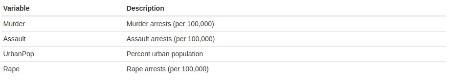
“This data set contains statistics, in arrests per 100,000 residents for assault, murder, and rape in each of the 50 US states in 1973. Also given is the percent of the population living in urban areas.” The variables are:
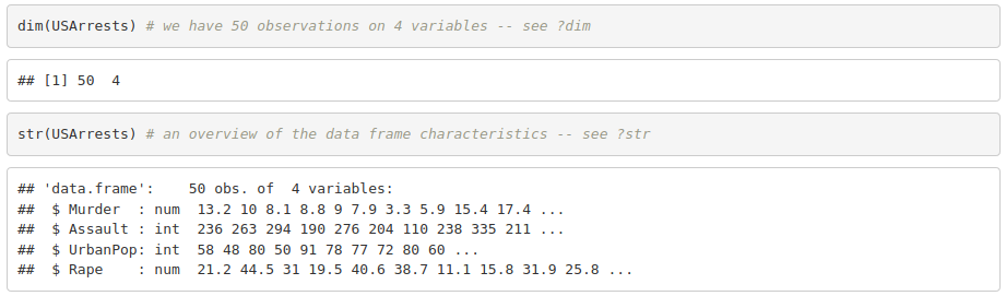
- Look for functions dim() and str(). What do they do?
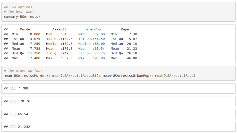
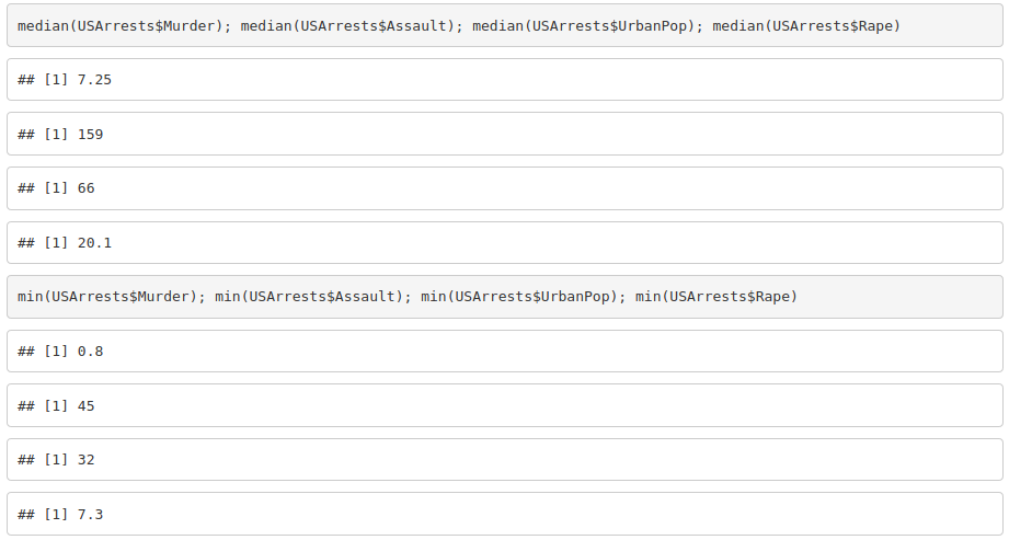
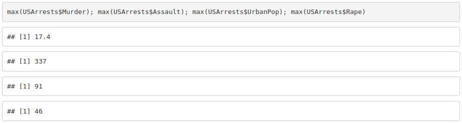
- Get the mean, median, minimum and maximum for each variable.
- Create a variable with the total number of crimes (murder, assault and rape).
- Add the new variable to the data frame.
- Export the data frame to a txt file.
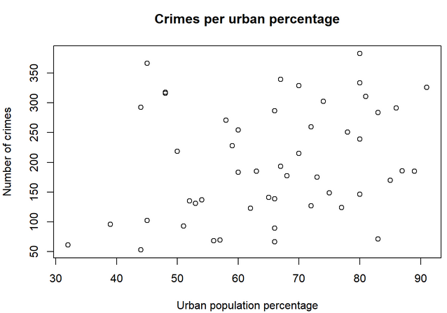
- Look for the function plot(). Can you plot the total number of crimes (y axis) against the Urban population percentage (x axis)? Add a title and labels for the axes.
Exercise 2
For this exercise we are going to use the dataset iris, available in R.
- Load the dataset (in the same way than in the previous exercise).
- Use help() to check its description.
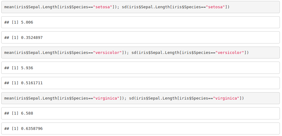
- Get the mean and standard deviation of the sepal width and length for each species of iris.
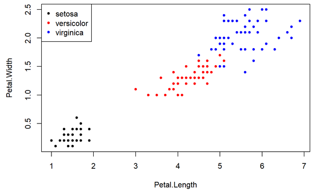
- Plot petal width against petal length.
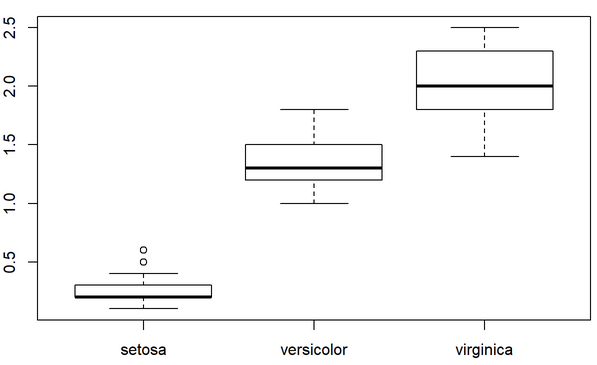
- Plot a histogram of the petal width per species.
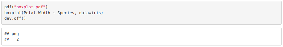
- Look for a way to export figures.
Part II
Exercise 3
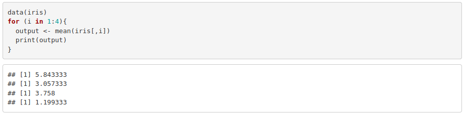
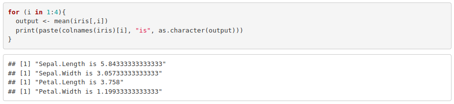
- Calculate and print the mean of each column of the dataset iris using a for loop. Hint: you are allowed to use mean().
- Modify the previous for loop so that it prints the mean along with the corresponding column name. Hint: you will probably need to use the functions colnames(), paste() and as.character().
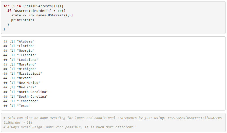
- Use an if statement into a for loop to print the states where murder is greater than 10 (USArrests dataset). Hint: you will need to use row.names() to extract the state name.
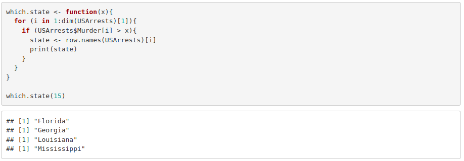
- Turn what you obtained into a function whose input argument substitutes the threshold that used to be just 10.
Exercise 4
Using the iris dataset:
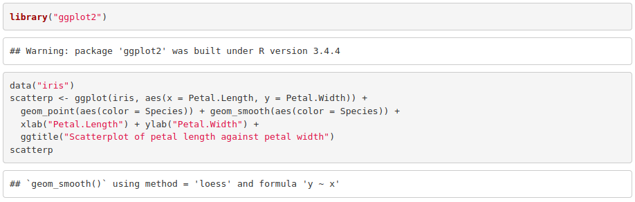
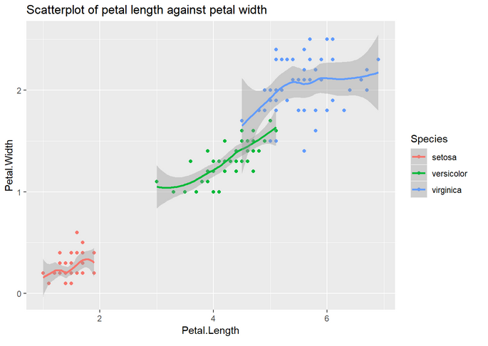
- Make a scatterplot with the petal length in the x axis and the petal width in the y axis. Use a different color and fit a curve per species.
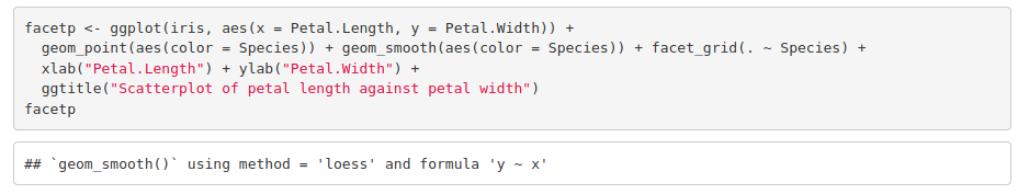
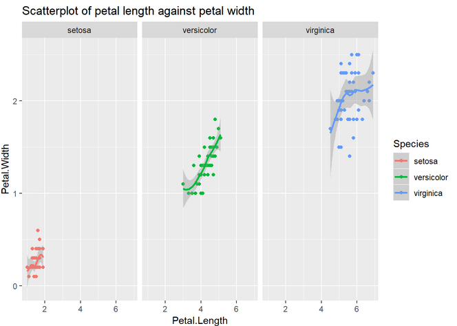
- Reusing the code above and using facet (see cheat sheet), reproduce the previous plot but separating it in three (one per species).
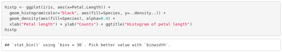
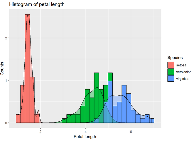
- Make a histogram of the petal length separating by species. Add a density plot by species. Hint: in order to have both the histogram and the density plot in the same scale, add y=..density.. to the histogram aesthetics. For the histogram to be visible, add some transparency to the density plot (alpha=0.4 will work).
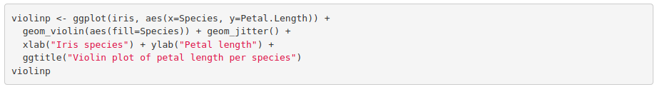
- Make a violin plot of the petal length and color by species. Hint: it is built in the exact same way than the boxplot from the tutorial. Just change the geometry function. Add geom_jitter(). Notice the difference between geom_jitter and geom_point.
Part III
Exercise 5
Repeat the same analysis done in Part III but this time comparing dose 0.5 to dose 2. Do not take into account the delivery method variable, as we have already checked there is no difference between them.
Part I
Exercise 1
1. Look for functions dim() and str(). What do they do?
2. Get the mean, median, minimum and maximum for each variable.
3. Create a variable with the total number of crimes (murder, assault and rape).

4. Add the new variable to the data frame.

5. Export the data frame to a txt file.

6. Look for the function plot(). Can you plot the total number of crimes (y axis) against the Urban population percentage (x axis)? Add a title and labels for the axes.

Exercise 2
For this exercise we are going to use the dataset iris, available in R.
1. Load the dataset (in the same way than in the previous exercise).

2. Use help() to check its description.
3. Get the mean and standard deviation of the sepal width and length for each species of iris.
4. Plot petal width against petal length.

5. Plot a histogram of the petal width per species.

6. Look for a way to export figures.
Part II
Exercise 3
1. Calculate and print the mean of each column of the dataset iris using a for loop. Hint: you are allowed to use mean().
2. Modify the previous for loop so that it prints the mean along with the corresponding column name. Hint: you will probably need to use the functions colnames(), paste() and as.character().
3. Use an if statement into a for loop to print the states where murder is greater than 10 (USArrests dataset). Hint: you will need to use row.names() to extract the state name.
4. Turn what you obtained into a function whose input argument substitutes the threshold that used to be just 10.
Exercise 4
Using the iris dataset:
1. Make a scatterplot with the petal length in the x axis and the petal width in the y axis. Use a different color and fit a curve per species.
2. Reusing the code above and using facet (see cheat sheet), reproduce the previous plot but separating it in three (one per species).
3. Make a histogram of the petal length separating by species. Add a density plot by species. Hint: in order to have both the histogram and the density plot in the same scale, add y=..density.. to the histogram aesthetics. For the histogram to be visible, add some transparency to the density plot (alpha=0.4 will work).
4. Make a violin plot of the petal length and color by species. Hint: it is built in the exact same way than the boxplot from the tutorial. Just change the geometry function. Add geom_jitter(). Notice the difference between geom_jitter and geom_point.
Part III
Exercise 5
Repeat the same analysis but this time comparing dose 0.5 to dose 2. Do not take into account the delivery method variable, as we have already checked there is no difference between them.
First, we filter the dataset:

To check normality, we visually inspect it:


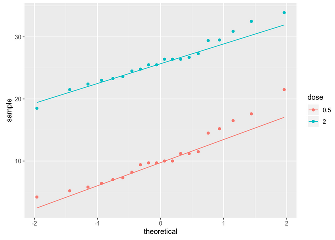
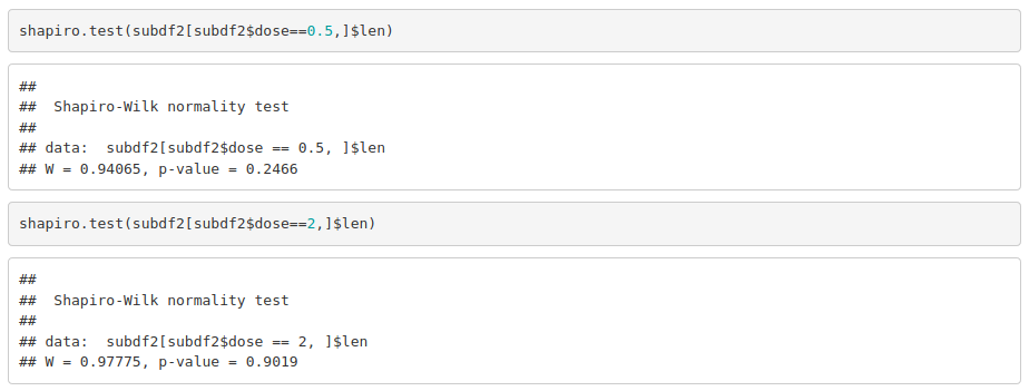
The data seems to be normally distributed. For more reliability, we use a significance test (on each group separately):
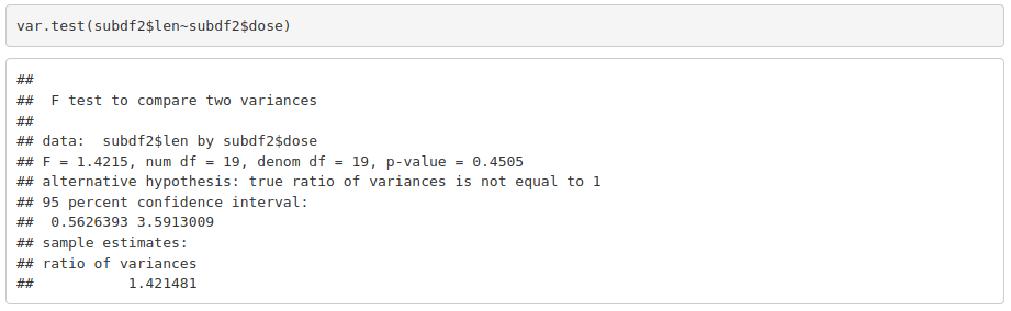
As data is normally distributed, we check if variances are equal in both groups:
With parametric assumptions being true, we can use a parametric test:
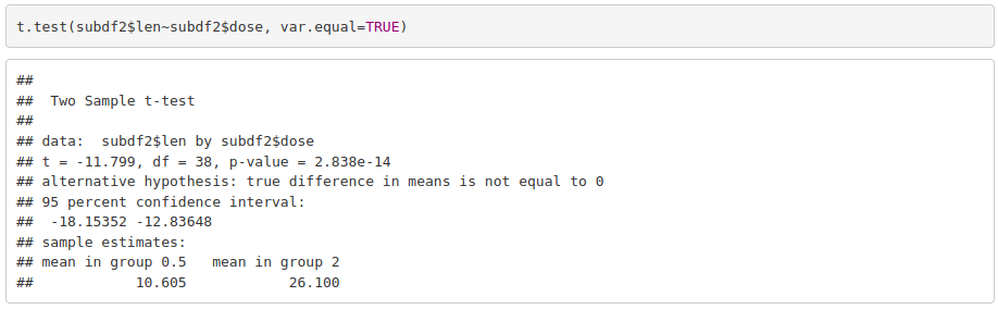
Odontoblasts length is significantly different between guinea pigs that received 0.5 mg/day and those that received 2 mg/day.